
老师资料里matplotlib里面的代码应该用的不是同一个文件了,要改一下

import numpy as np
import pandas as pd
import matplotlib.pyplot as plt

students = pd.read_excel('D:/Temp/Students10.xlsx')
students.sort_values(by='2017', inplace=True, ascending=False)
students.index = range(0, len(students))
print(students)

bar_width = 0.7
x_pos = np.arange(len(students) * 2, step=2)
plt.bar(x_pos, students['2016'], color='orange', width=bar_width)
plt.bar(x_pos + bar_width, students['2017'], color='red', width=bar_width)

plt.xticks(x_pos + bar_width / 2, students['Field'], rotation='90')
plt.title('International Student by Field', fontsize=16)
plt.xlabel('Field')
plt.ylabel('Number')
plt.tight_layout()
plt.show()

任务10:绘制分组柱图,深度优化图标
本节大部分内容各位上节课的复习内容。
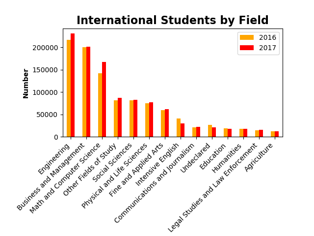
import pandas as pd
import matplotlib.pyplot as plt

students = pd.read_excel('C:/Temp/Students.xlsx')
students.sort_values(by='2017', inplace=True, ascending=False)
print(students)
students.plot.bar(x='Field', y=['2016', '2017'], color=['orange', 'red'])
plt.title('International Students by Field', fontsize=16, fontweight='bold')
plt.xlabel('Field', fontweight='bold')
plt.ylabel('Number', fontweight='bold')
ax = plt.gca()
ax.set_xticklabels(students['Field'], rotation=45, ha='right')
f = plt.gcf()
f.subplots_adjust(left=0.2, bottom=0.42)
#plt.tight_layout()
plt.show()
几个注意的点:
1. 在定义x轴(x=)和y轴(y=)的时候,对于需要分组显示的部分要注意使用list,比如示例中的 y=['2016', '2017'], color=['orange', 'red']
2. pandas制图是基于matplotlib的。
3. 在优化title,xlabel, ylabel的时候修改字号,字体使用“fontsize=”,fontweight=' '。
4. 修改X/Y轴的一个函数 plt.gca()
用法:
ax = plt.gca()
ax.set_xticklabels(students['Field'], rotation=45, ha='right')
注:ha=’right‘意思是按照文字右上角为基点进行旋转。
5. 修改左右空白空间的函数plt.gcf()
用法:
f = plt.gcf()
f.subplots_adjust(left=0.2, bottom=0.42)
授课教师
Tim老师
课程特色
视频(30)
下载资料(25)